Segmented Control
Segmented Controls are used to group multiple options, changing what content the user sees in a part of the screen. They give layouts a clear sense of information hierarchy and reduce the need to have too much on the screen at a time. When a control is active, information below the control should also be updated.
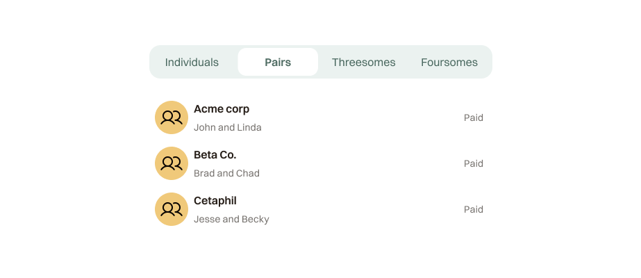
preview
props
| Prop | Type | Default | Description |
|---|---|---|---|
options | SegmentedOption[] | required | Array of segments, each with a value and label. |
value | string | required | The currently active segment value. |
onChange | (value: string) => void | required | Called when the user selects a segment. |
usage
Use a segmented control to provide closely related choices that affect an object, state, or view. Only one control can be active at a time. Aim for no more than five or six segments — two or three is ideal.
When to use
- To sort information on a screen
- To shift between views
Do not use
- To control the entire content of the screen — it shouldn't affect overall nav structure
- With too many segments — they become hard to parse and slow to navigate
DoUse when switching between closely related views
Don’tUse to replace primary navigation
variants
2 segmentsThe default. Best for binary choices.
3 segmentsIdeal for three closely related views.
4+ segmentsUse sparingly. Keep labels short.
states
DefaultUnselected segment
HoverSubtle background on hover
ActiveElevated white pill with shadow